Image Gallery Layout Strategies / I Hate Aspect Ratios
Note: if you're on mobile, the demos won't work very well. Put your phone in the landscape orientation or come back on a computer.
If you've ever uploaded art or photography to a website you know the pain of being forced to crop your work (or worse, when they crop it for you!). It's frustrating to have to do this because usually every part of the image is the product of a lot of time and effort, and cropping even a tiny fraction of that out of frame is basically butchering my precious baby. Since this my website, I get to make the my image gallery the way I want. With flapjacks, and cookers.
Unfortunately actually having to implement something often times illustrates why things are the way they are. I've gone through just about every common format, and I've compiled them into this webpage so you don't have to.
The problem gap, literally
The fundamental problem is that we're trying to tile rectangles of totally different aspect ratios tastefully such that our viewers can traverse our textless topics in any format, whether by touchscreen or regular-screen.
Grid
Arrange the images in a simple CSS grid.



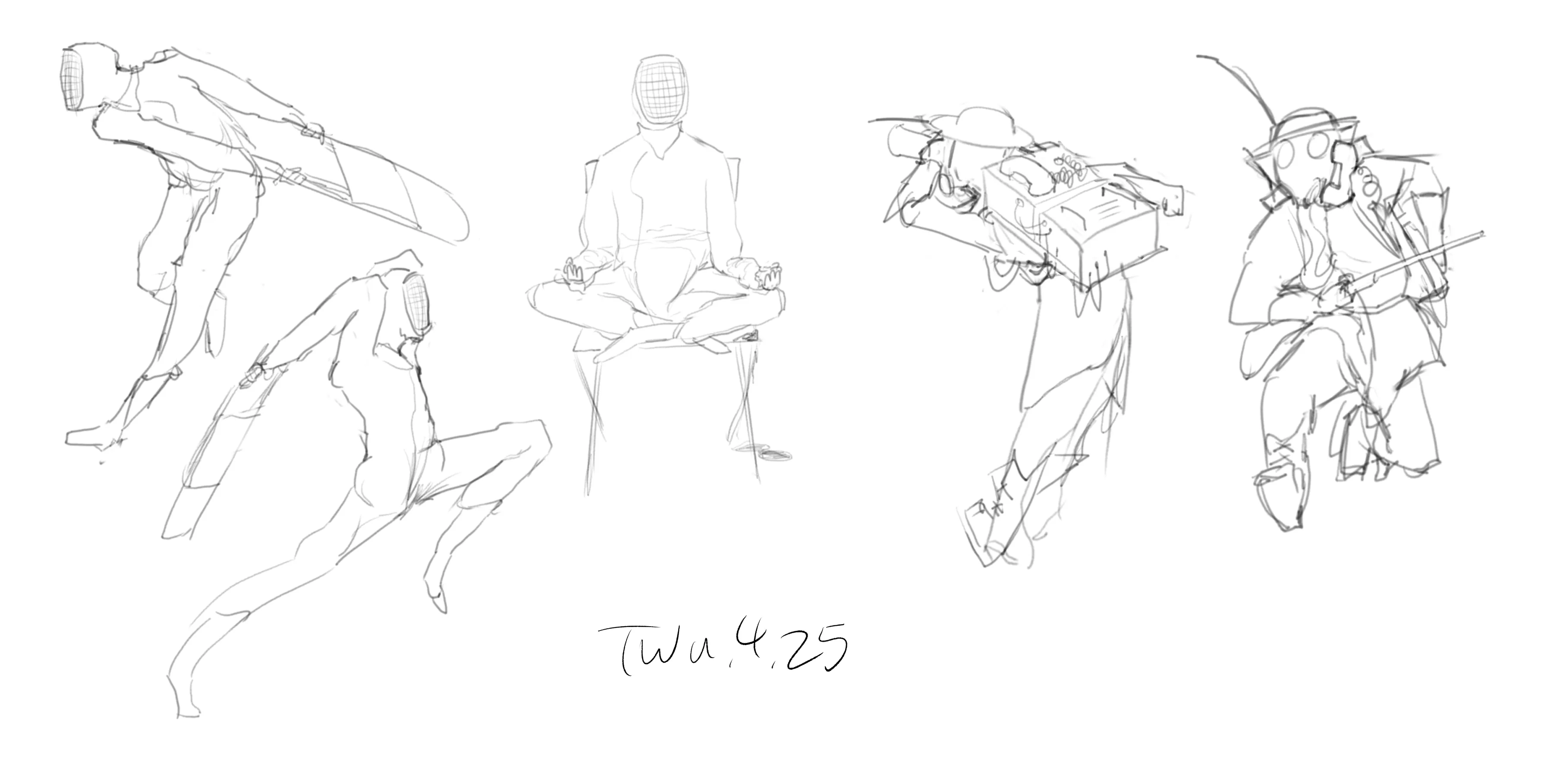
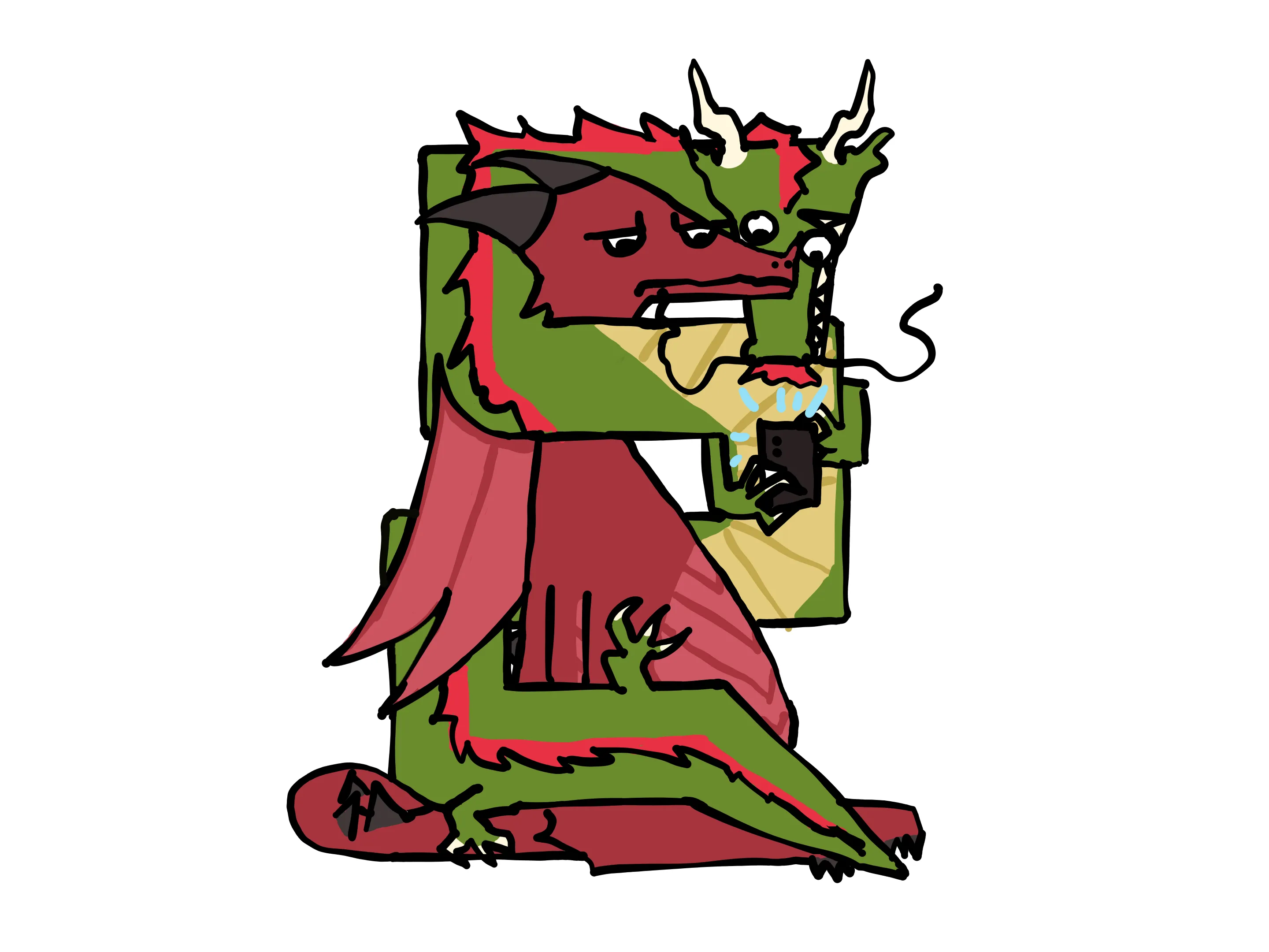

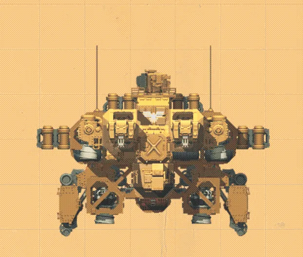
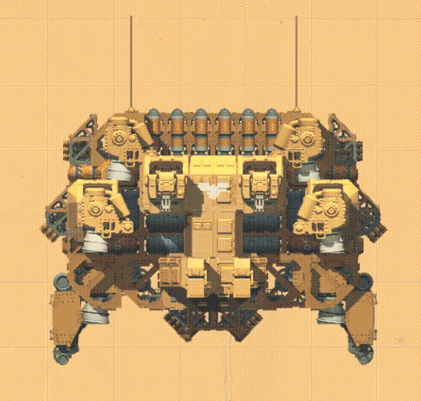
Pros:
- Incredibly simple
Cons:
- Ugly gaps, especially when one image is much taller than the others in it's row
Code
<div class="gallery-item"> <img src="https://placehold.co/600x400/orange/white"/></div><div class="gallery-item"> <img src="https://placehold.co/1000x400/red/white"/></div><div class="gallery-item"> <img src="https://placehold.co/600x800/green/white"/></div>.grid { display: grid; grid-template-columns: repeat(auto-fill, minmax(200px, 1fr)); gap: 1rem;}.gallery-item img { width: 100%;}Cover
The most obvious solution is to simply let your images expand to take up all the space it's allowed. This is basically the best you can do on a mobile screen, but you can see the obvious problem on PC screens - square/tall images balloon in size and end up being cropped by the edge of the screen.
Code
<div class="gallery-item"> <img src="https://placehold.co/600x400/orange/white"/></div><div class="gallery-item"> <img src="https://placehold.co/1000x400/red/white"/></div><div class="gallery-item"> <img src="https://placehold.co/600x800/green/white"/></div>.gallery-item { width: 100%; margin-bottom: 1rem;}
.gallery-item img { display: block; width: 100%;}Masonry (Simple)
This takes the previous arrangement and simply splits it into multiple columns depending on the width of the user's screen using a bit of CSS. This prevents a single tall image from hoarding all the screen's real estate. The big downside - and also the reason why I've put numbers on this one - is that the images are filled top-to-bottom per column, and then left-to-right across columns. This means that the specific order is dependent on the quantity of columns, which is dependent on the user's screen size. This is a dealbreaker if you want to sort the images by anything.
Pros:
- No more ugly gaps!
- Browser automatically creates more columns based on space
Cons:
- Order is ruined, as columns are filled first, left to right
- Image dimensions must be known beforehand (pulling images live shifts images constantly)
Code
<div class="grid"> <div class="gallery-item"> <img src="https://placehold.co/600x400/orange/white"/> </div> <div class="gallery-item"> <img src="https://placehold.co/1000x400/red/white"/> </div> <div class="gallery-item"> <img src="https://placehold.co/600x800/green/white"/> </div></div>.grid { column-width: 12rem; column-gap: 1rem;}
.gallery-item { position: relative; margin-bottom: 1rem;}Masonry (Complex)
This approach dynamically re-orders the images in the columns using JS, in this case Masonry-Grid.js. It's obviously a much heavier solution than the simple CSS columns, but it allows for preserving the order of images.
Pros:
- Maintains order (mostly)
Cons:
- Recalculated in JS on resize
- You need to know the image aspect ratio beforehand
- Order can still be thrown off by very tall images
- Adds a dependency
Code
npm install @masonry-grid/vanilla<div class="grid" id="complexmasonry"> <!--Note: Grab the width and height programatically using JS if you can.--> <div class="gallery-item" style={`--width: 600; --height: 400;`}> <img src="https://placehold.co/600x400/orange/white"/> </div> <div class="gallery-item" style={`--width: 1000; --height: 400;`}> <img src="https://placehold.co/1000x400/red/white"/> </div> <div class="gallery-item" style={`--width: 600; --height: 800;> <img src="https://placehold.co/600x800/green/white"/> </div></div>.grid { display: grid; overflow: hidden; gap: 1rem; grid-template-columns: repeat(auto-fill, minmax(12rem, 1fr));}
.gallery-item { position: relative; aspect-ratio: var(--width) / var(--height);}
.gallery-item img { width: 100%;}import { BalancedMasonryGrid } from "@masonry-grid/vanilla";
const grid = document.getElementById("complexmasonry");
if (grid) { new BalancedMasonryGrid(grid)}Uniform Layouts
Force the images and their rebellious non-uniform aspect ratios into neat, perfect squares. Quite common for mobile-first layouts.
Naive Cropping
Pros:
- Simple to implement
- Neat, predictable arrangement
Cons:
- Often crops your work in the worst possible way
- Makes me very sad
Code
<div class="grid" id="complexmasonry"> <div class="gallery-item"> <img src="https://placehold.co/600x400/orange/white"/> </div> <div class="gallery-item"> <img src="https://placehold.co/1000x400/red/white"/> </div> <div class="gallery-item"> <img src="https://placehold.co/600x800/green/white"/> </div></div>.grid { display: grid; grid-template-columns: repeat(auto-fill, minmax(200px, 1fr)); gap: 1rem;}
.gallery-item img { width: 100%; aspect-ratio: 1 / 1; object-fit: cover; object-position: center;}Background Blur
Pros:
- Still pretty simple to implement
- Neat, predictable arrangement
- No cropping
Cons:
- Gradients can end up being jarring/ugly
- Works a lot better for photos than drawings (the blur can be incredibly visually noisy compared to a flat drawing)
- Gives me a headache
Code
<div class="grid"> <div class="gallery-item"> <div class="image-container"> <img class="blur-background" src="https://placehold.co/600x400/orange/white"/> <img class="main-image" src="https://placehold.co/600x400/orange/white"/> </div> </div> <div class="gallery-item"> <div class="image-container"> <img class="blur-background" src="https://placehold.co/1000x400/red/white"/> <img class="main-image" src="https://placehold.co/1000x400/red/white"/> </div> </div> <div class="gallery-item"> <div class="image-container"> <img class="blur-background" src="https://placehold.co/600x800/green/white"/> <img class="main-image" src="https://placehold.co/600x800/green/white"/> </div> </div></div>.grid { display: grid; grid-template-columns: repeat(auto-fill, minmax(200px, 1fr)); gap: 1rem;}
.gallery-item { text-decoration: none; color: inherit;}
.image-container { position: relative; width: 100%; aspect-ratio: 1 / 1;}
/* Blurred background layer */.blur-background { position: absolute; width: 100%; height: 100%; object-fit: cover; object-position: center; filter: blur(8px) brightness(0.8); z-index: 1;}
/* Main image on top */.main-image { position: relative; width: 100%; height: 100%; object-fit: contain; object-position: center; display: block; z-index: 2;}Dominant Color
Pros:
- Works great for images with single-tone backgrounds, like drawings
Cons:
- Doesn't work well for images with many colors, like photos or paintings
- Requires computation from the client, resulting in a mandatory background transition
- Adds a dependency
Code
npm install fast-average-color<div class="grid" id="complexmasonry"> <div class="gallery-item"> <img class=thumb src="https://placehold.co/600x400/orange/white"/> </div> <div class="gallery-item"> <img class=thumb src="https://placehold.co/1000x400/red/white"/> </div> <div class="gallery-item"> <img class=thumb src="https://placehold.co/600x800/green/white"/> </div></div>.grid { display: grid; grid-template-columns: repeat(auto-fill, minmax(200px, 1fr)); gap: 1rem;}
.gallery-item { display: block; text-decoration: none; color: inherit;}
.thumb { aspect-ratio: 1 / 1; overflow: hidden; background-color: #1a1a1a; /* Background color until the script determines the dominant color */ transition: background-color 0.3s;}
.thumb img { width: 100%; height: 100%; object-fit: contain; object-position: center;}import { FastAverageColor } from "fast-average-color";
const fac = new FastAverageColor();
function applyColor(img: HTMLImageElement, thumb: HTMLElement) { try { thumb.style.backgroundColor = fac.getColor(img, { algorithm: "dominant" }).hex; } catch (err) { console.warn("fast-average-color failed", err); }}
document.querySelectorAll<HTMLElement>(".thumb").forEach((thumb) => { const img = thumb.querySelector("img"); if (!img) return;
if (img.complete && img.naturalWidth > 0) { applyColor(img, thumb); } else { img.addEventListener("load", () => applyColor(img, thumb), { once: true }); }});My grievance with all of these strategies.
The big problem with these approaches is that they does not respect the relative size of images. Uniform approaches have to cut/shrink images to fit squares. The masonry approaches can only expand in one axis, meaning tall images get a huge amount of space compared to landscape images. This all becomes especially problematic for comic strips, which can end up being either tiny or huge depending on their orientation. The thing that's so bothersome about this is that the size implies something about the importance of your art - if there's a piece you're really proud of but it's crammed into a tiny spot around other pieces, chances are it's not going to get the attention it deserves when people have to squint to see it.
Conclusion
With how many options there are, why do so many websites default to a rather simple and naive approach, when they for sure could develop some advanced heuristic / AI solution? Well the problem is most likely the age old disconnect between artists and art consumers - artists want other people to get their ideas in the most "pure" way possible, whereas art consumers simply want to view art the way that's convenient for them.
While I'd love for people who view my drawings to sit down in a chair, load my art in fullscreen and as big as their monitor can possibly fit. But the reality is that 99% of people viewing my art are just scrolling through it on their phone as idle entertainment. Platforms cater to this, and who am I to judge how people choose to enjoy my art?
Ultimately the implementation of a gallery balances these three elements: Source Accuracy, User Convenience, and Ease of Implementation. It's that damn tradeoff triangle again.
Benn Jordan's dialogue on Music is illustrative here.